iOS visual language
iPhone · iOS 26
Quiet chrome. System materials. One accent.
This is how sōon looks on iPhone, not a component library. Prefer the system: lists, sheets, toolbars, switches, pickers, charts, SF Symbols. Draw only what the system cannot. Android follows Material 3; it is not this page.
Color
Ink and fill are the system's primary, secondary, and grouped backgrounds. We own one accent. Pause adds three families, each with a light and dark version. One chip suffices.
Appearances
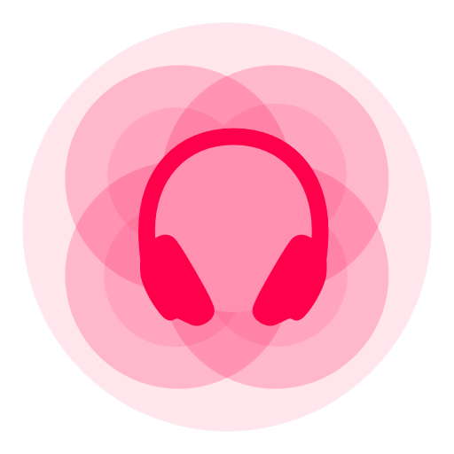
Light and Dark are first-class features, not a theme. Home Screen icons include Default, Dark, Clear, and Tinted. The springboard icon is unfinished. Symbols have hierarchical or palette appearances, not baked bitmaps.
Type
System text styles. Rounded only for timer digits and Pause. No custom typeface.
Favorites
Nine ambient sounds, not nine hundred.
Caption · secondary
15:00
Glyphs
SF Symbols, default weight. Names only. Fill when the control is on (e.g. heart.fill, pause.circle.fill). Custom marks belong in the SF Symbols pipeline as custom symbols (soon.app.cat), so they tint, scale, and track appearance like others. SVG or PNG is a fallback (widgets, Watch, or unsupported hosts), not the default.
- e.g. heart
- play.circle
- timer
- lungs.fill
- soon.app.cat
Shape
Continuous corners. 16 on compact controls, 24 on cards. Capsules for chips. A 36×4 drag pill between favorites and the catalog.
Chrome
Sketches of the real surfaces, not screenshots, and not Liquid Glass. System materials do the work; CSS can only hint.
Track row
Timer
Timer
15:00
Sheet
Favorites
Haptics
System switch, accent tint. Short and intentional: phase taps on Pause, optional wash on Heartbeat and Purring. Motion stills the canvas and row bars.
History
Swift Charts, accent bars, system axes. VoiceOver and large type fall back to a list. No custom graph language. One chart type is enough.
Motion
Short springs (timer, sheets). A one-shot symbol wiggle on the BPM chip. Charts fill once. Reduce Motion turns all of that off. No looping decoration.
Don’t
- No extra palette. No custom typeface. No PNG icon kit.
- No Home Screen icon that ignores Dark, Clear, or Tinted.
- No custom control where a system one exists.
- No glass on everything. Materials are for chrome, not decoration.
- No wellness aesthetic. Audio masking stays the product.